Moneda · 2024
AI Chat for Payments

We had the research. The question was whether AI could make payments feel like a conversation.
This project didn't start from scratch. It started from everything we'd already learned: two Google Design Sprints, a field research trip to the Dominican Republic, years of observing how Nano Business Units — small merchants, corner stores, colmados — actually thought about paying bills and moving money.
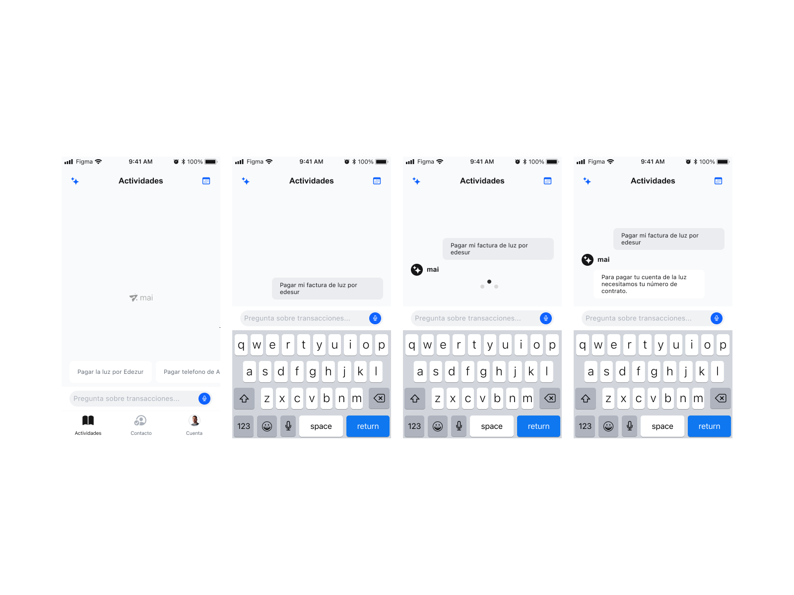
The pattern was consistent. Users knew exactly what they wanted to do. The structured UI was the obstacle. A form asking for a biller category, account number, and payment confirmation was three steps too many for someone who just wanted to pay their electricity.
The Opportunity
WhatsApp was already the default communication layer for NBUs in the DR. They were comfortable typing what they needed. If we could meet users in that mental model — natural language, conversational flow — we could eliminate the navigation overhead entirely and make payments feel like sending a message.
We tested how users understood AI before we designed anything.
Beyond our existing field research, we conducted in-house research specifically for this project: testing users' understanding of language patterns, interactions, and expectations with conversational AI in a payments context.
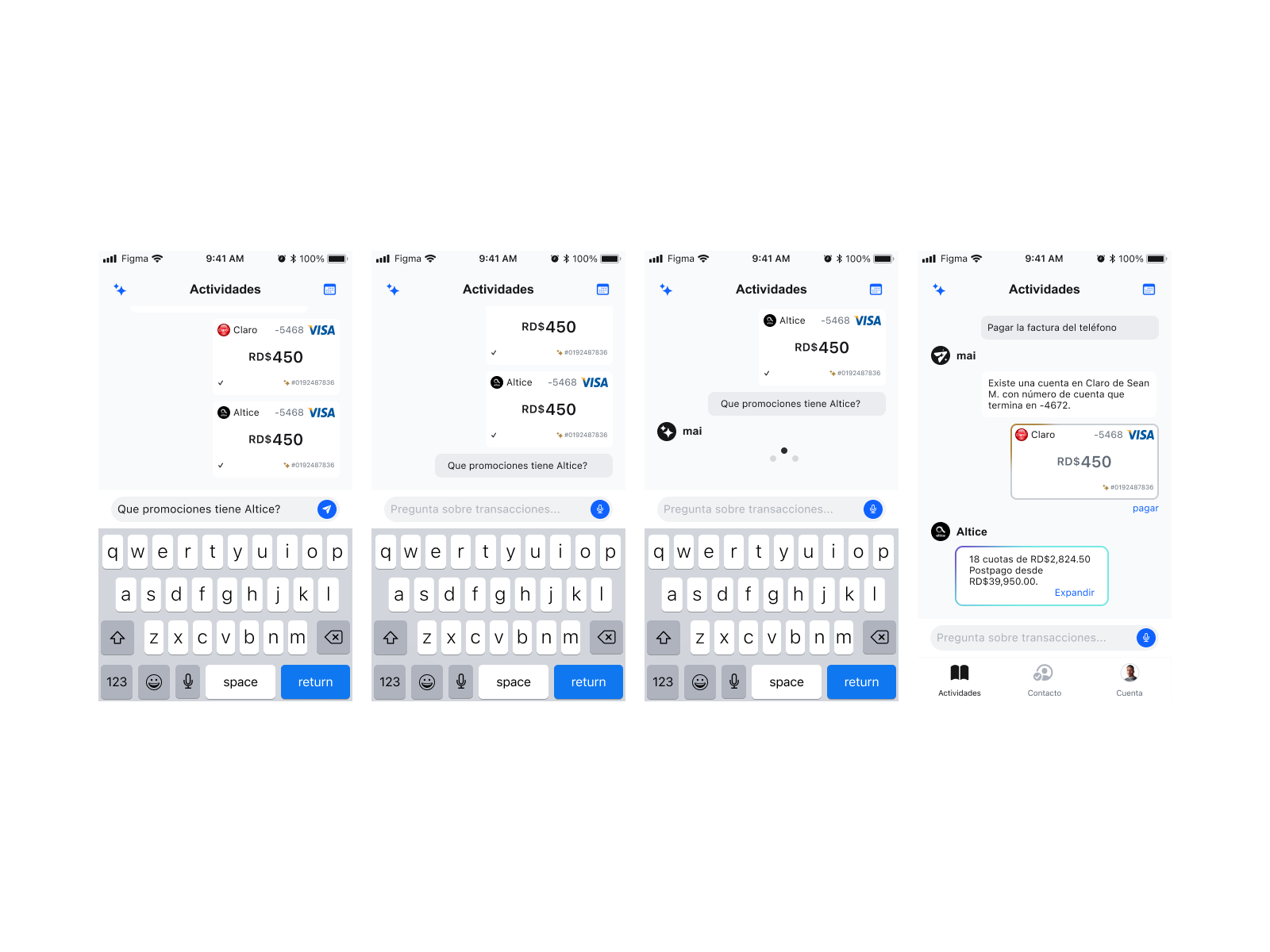
We focused on three areas: how users expected auto-complete to behave when typing a biller name, how they interpreted AI-generated suggestions versus AI-executed actions, and where the mental model of "chat" conflicted with the mental model of "transaction." The findings shaped every scope and copy decision that followed.
Key Research Finding
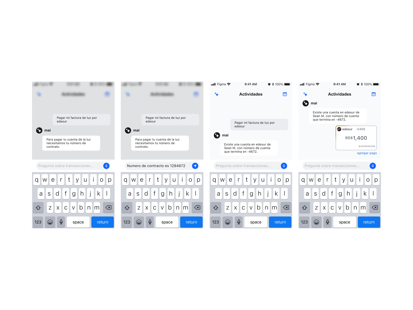
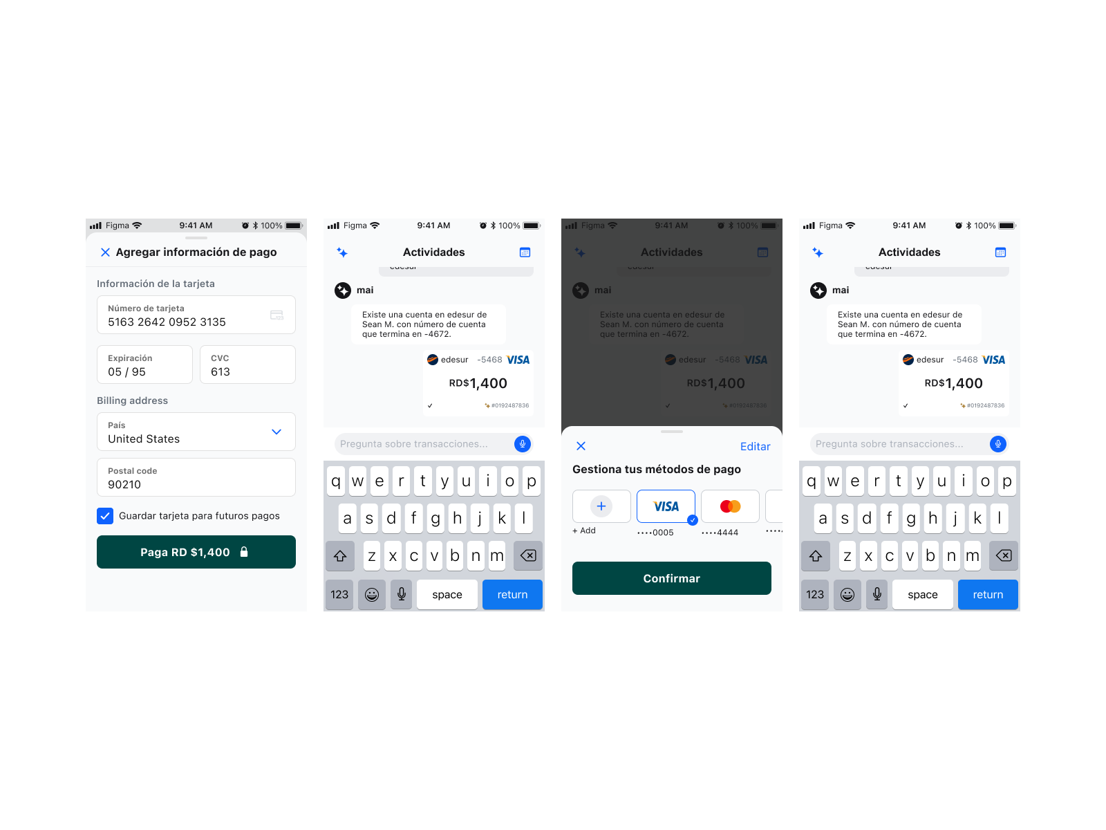
Users were comfortable with AI surfacing suggestions. They were not comfortable with AI taking action without a clear confirmation step. The distinction between "the AI is recommending" and "the AI is doing" needed to be visible and unambiguous — especially in a financial context where a wrong transaction carries real consequences.
Designing for AI means designing the edges, not just the happy path.
Designing an AI interface is fundamentally a scope problem. The visual design is almost secondary — the real work is mapping every possible user intent, deciding which ones the AI handles, and designing what happens when it encounters everything else.
I mapped the full payment intent space: bill pay, P2P transfer, balance inquiry, transaction history, agent lookup. For each intent I designed the resolved path, the ambiguous path (AI asks a clarifying question), and the failure path (AI defers to structured UI or a human). I wrote the conversation flows in plain text before touching Figma.
The WhatsApp parallel was intentional and explicit in the design. Familiar bubble layout, familiar input field, familiar send button. The AI wasn't trying to feel futuristic — it was trying to feel like something NBUs already used every day. The only difference was that this conversation moved money.
Auto-complete and auto-fill patterns were treated with particular care based on the research findings. Suggestions appeared as selectable chips, not pre-filled text. Users chose — the AI never assumed.
The Core Design Principle
Trust before capability. Every AI interaction was designed around a single constraint: the AI suggests, the user decides. No auto-execution. No assumed intent. A clear confirmation before any transaction processed. In a market where digital trust was the entire product, this wasn't conservative design — it was the only design that could work.
Designed end to end. Handed to engineering.
The design was completed and delivered to the engineering team — full conversation flows, edge case handling, component specs, and copy for every AI state including resolution, ambiguity, partial match, and graceful failure. The product has not yet launched publicly.
What this project proved: AI features for underserved markets require more research groundwork, not less. The design sprint methodology we'd used to validate Moneda's core product gave us the foundation to move quickly on a genuinely complex interaction system — because we already understood the users, the context, and what trust meant in this specific environment.
What This Project Added
Designing AI interaction for NBUs in LATAM is a different problem than designing it for a Western market. The literacy assumptions are different. The trust threshold is different. The mental models are different. This project was about taking genuine field knowledge and translating it into interaction patterns an AI could work within — not retrofitting a generic chat UI onto a payments context.
Next Project
TodayTix / Alicia Keys · 2023
Hell's Kitchen Website
Site for Alicia Keys' Grammy-winning Broadway show.
