Moneda · 2021–2023
Mobile Secure Digital Wallet

55% of the Dominican Republic had no bank account. Cash was the only option — and COVID made it dangerous.
In 2021, the COVID-19 pandemic amplified a problem that had existed for decades in the Dominican Republic: 55% of the population had no access to banking. Physical cash was the only option — and carrying it had become genuinely dangerous as crime rates climbed alongside pandemic-driven job loss.
I co-founded Moneda to close that gap. Not by adapting a Western fintech product for a new market — but by going to the Dominican Republic first, learning how people actually moved money, and building something designed for that reality from the ground up.
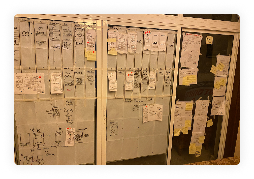
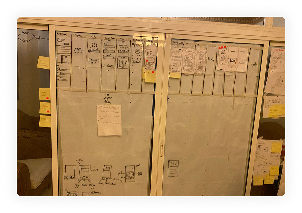
Two Google Design Sprints. Two weeks. Before we booked a single flight.
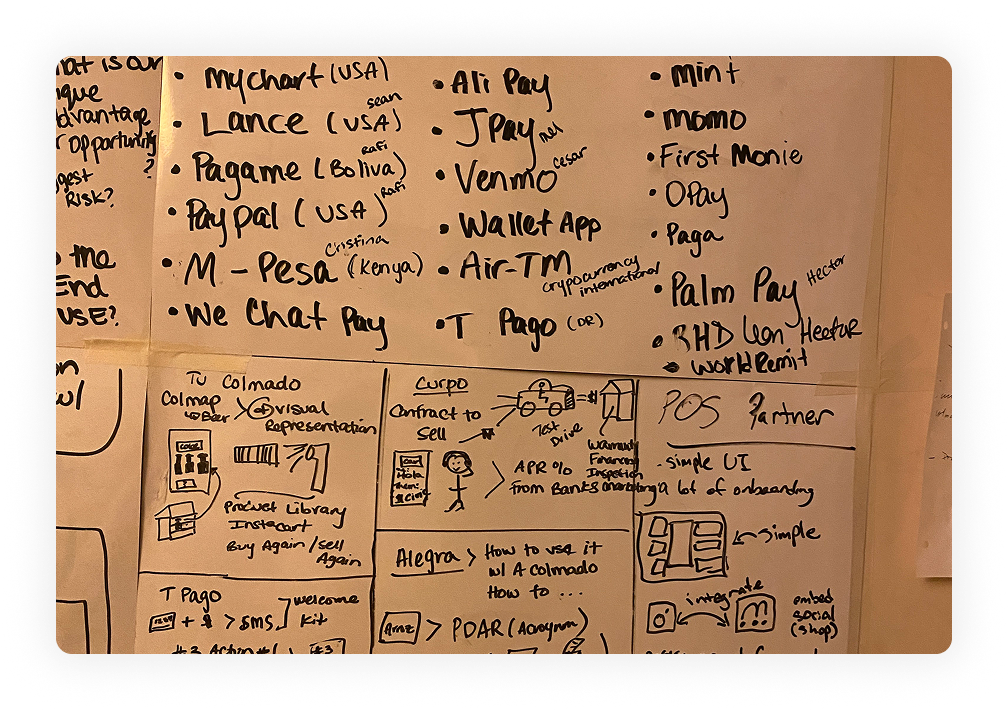
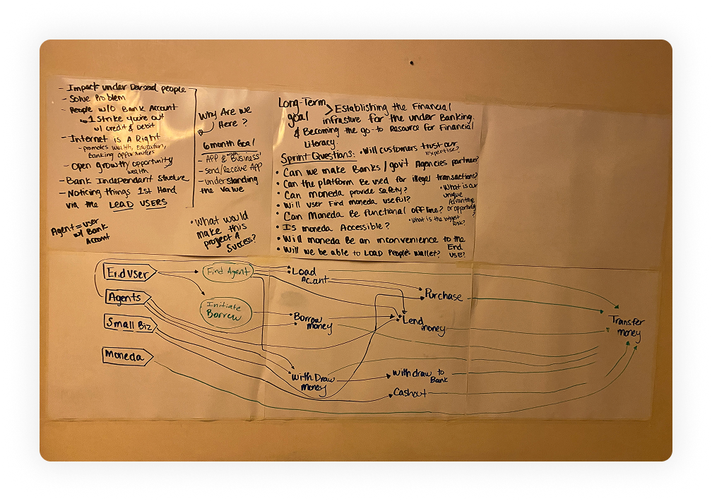
We started with two back-to-back Google Design Sprints — five focused days each — before traveling to the Dominican Republic. The goal wasn't to design the product. It was to surface the assumptions we were carrying so we could test them against reality in the field.
Each sprint forced us to move fast: map the problem on Monday, sketch competing solutions Tuesday, commit to a direction Wednesday, prototype Thursday, test Friday. By the end of two weeks we had a clear picture of what we thought we knew — and a list of questions that only the field could answer.
What the Sprints Revealed
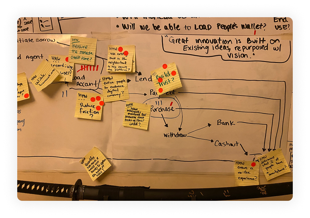
We discovered early that our initial assumptions about user trust, payment behavior, and digital literacy were built on a Western fintech mental model that didn't apply. The sprints didn't produce the product — they produced the right questions to take into the Dominican Republic.
We went to the Dominican Republic. We listened before we designed.
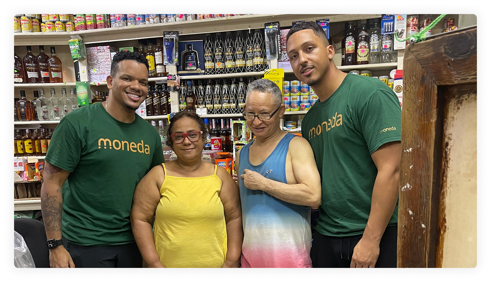
We traveled to the Dominican Republic and visited colmados — the corner stores that function as informal financial and social hubs across Dominican neighborhoods. We ran structured interviews and observations with residents across income levels, ages, and degrees of smartphone familiarity.
Three questions drove every conversation: Would users trust a digital wallet? Was going digital compelling enough to change deeply ingrained behavior? How do we get something real in front of users fast enough to learn before we overbuild?
The Central Finding
Trust was the entire product. Not features. Not speed. Not polish. If the app didn't feel safe and transparent from the very first screen, nothing else would matter. Every version of Moneda that followed was built on that single insight.
A brand built for the Dominican Republic — not adapted for it.
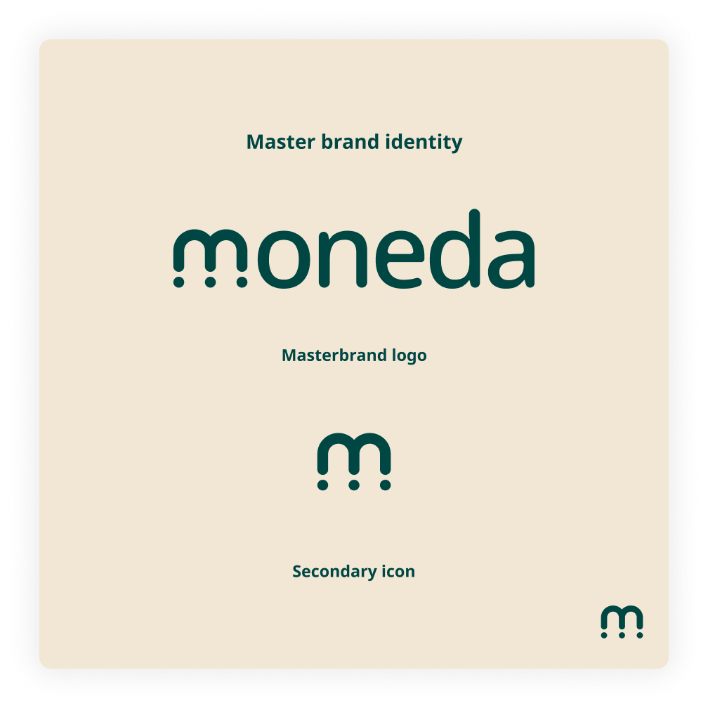
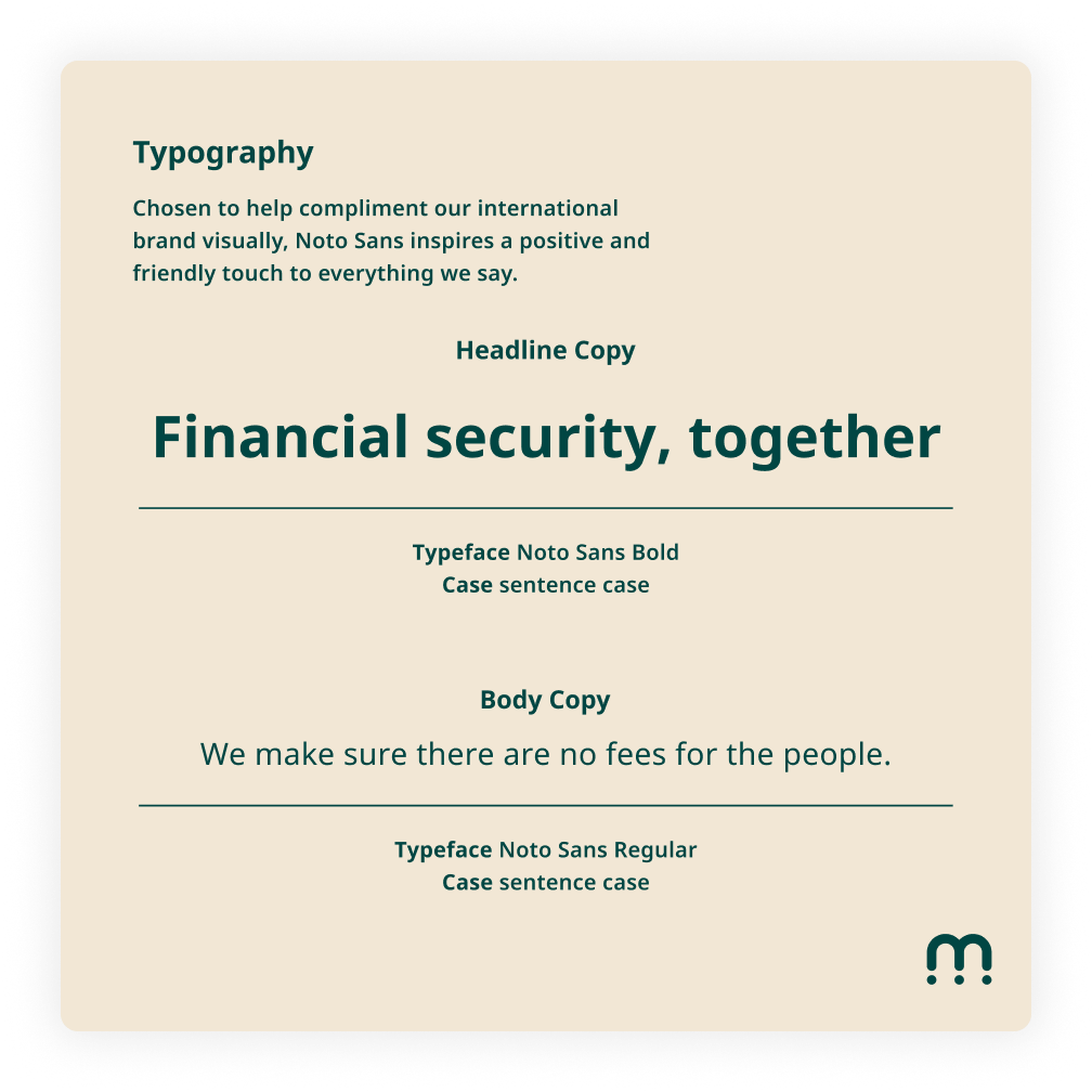
Out of the sprint work and field research came a visual identity built from scratch for this context. Deep green and warm gold pulled from the landscape and culture of the Dominican Republic. Typography chosen for warmth and legibility in Spanish. A mark simple enough to work across screens, receipts, and a t-shirt worn in a colmado.
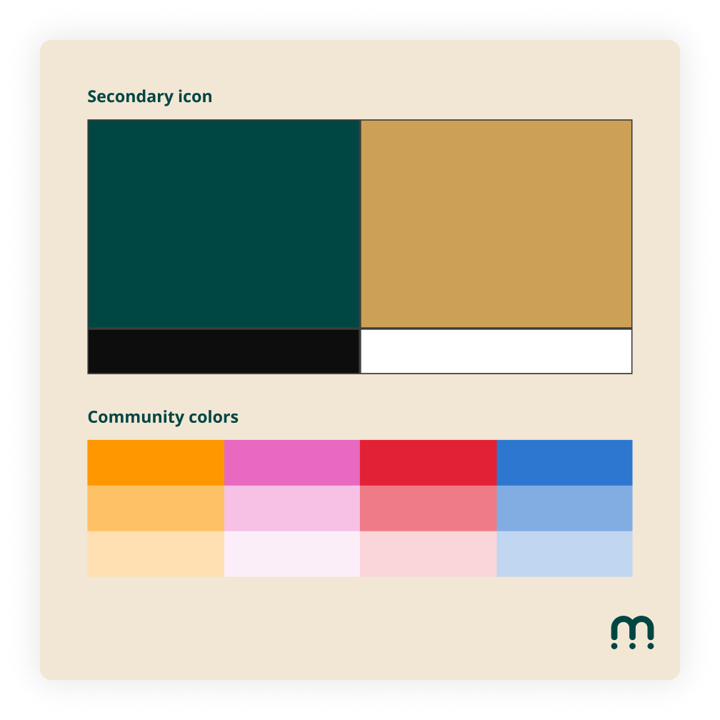
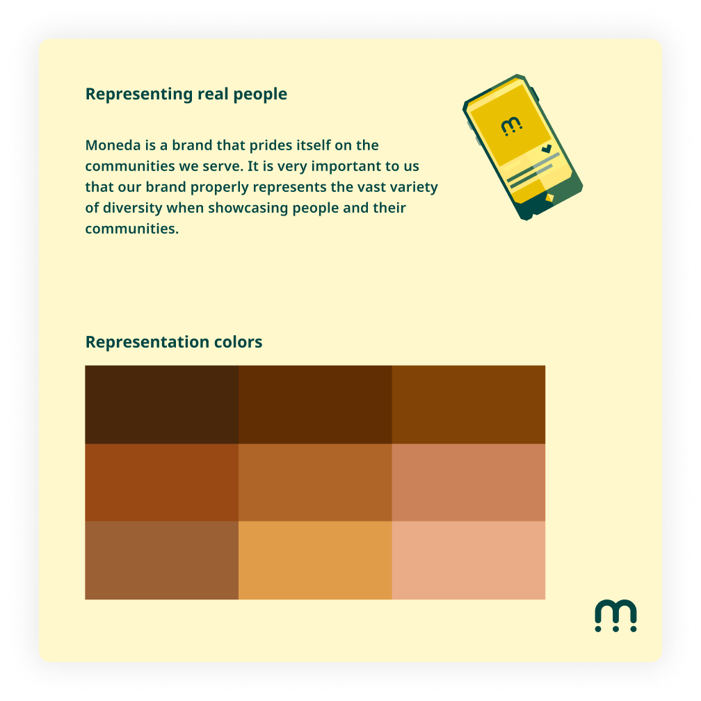
Representation was a core brand principle — not an afterthought. The identity system included a skin-tone range for community imagery and explicit guardrails for how the brand showed up around real people from the Dominican Republic.
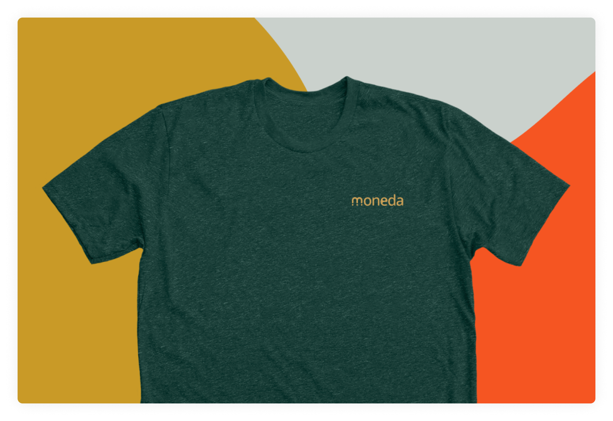
The brand extended into the field: the team wore Moneda in the colmados where we were conducting research — grounding the product in the community it was built for.
Paper prototypes in colmado parking lots. Real signal before real investment.
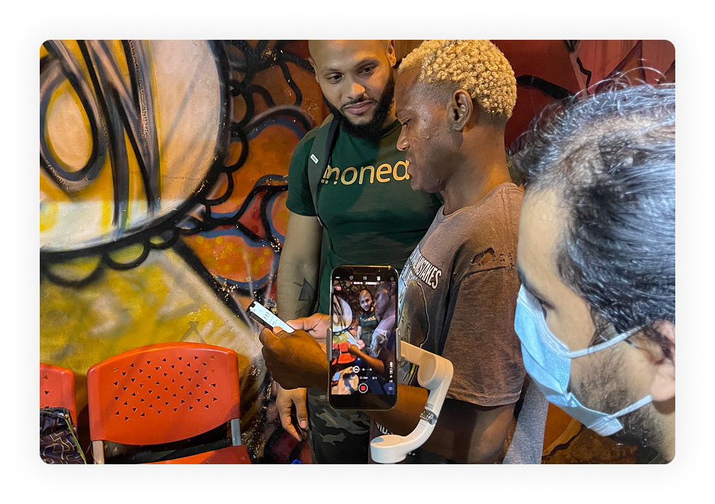
Phase 1 had one goal: prove usability before spending a single hour on high-fidelity design. We ran crazy-eights sessions to generate directions fast, built paper prototypes, and took them back into the field — testing with real users in the same environments where the product would actually be used.
Interactions that seemed obvious to us were invisible to first-time digital wallet users. Language that felt neutral came across as cold and institutional. Those failures weren't setbacks. They were the most valuable research we ran. Every decision in Phase 2 traced back to something that broke in a colmado parking lot.
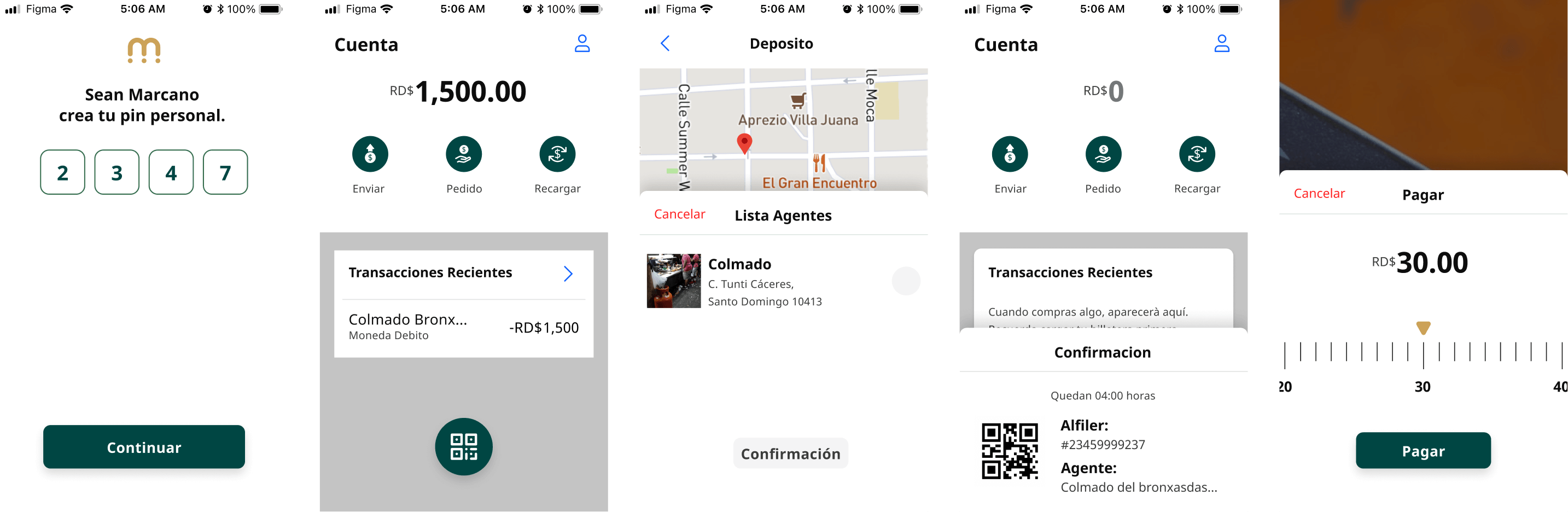
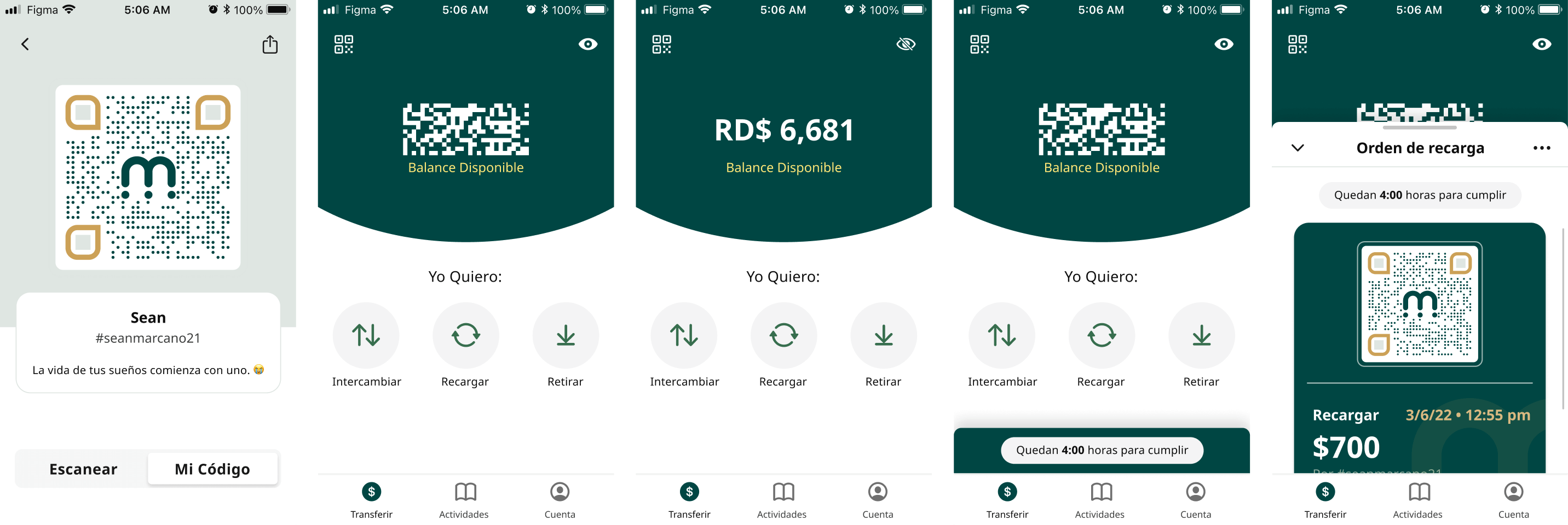
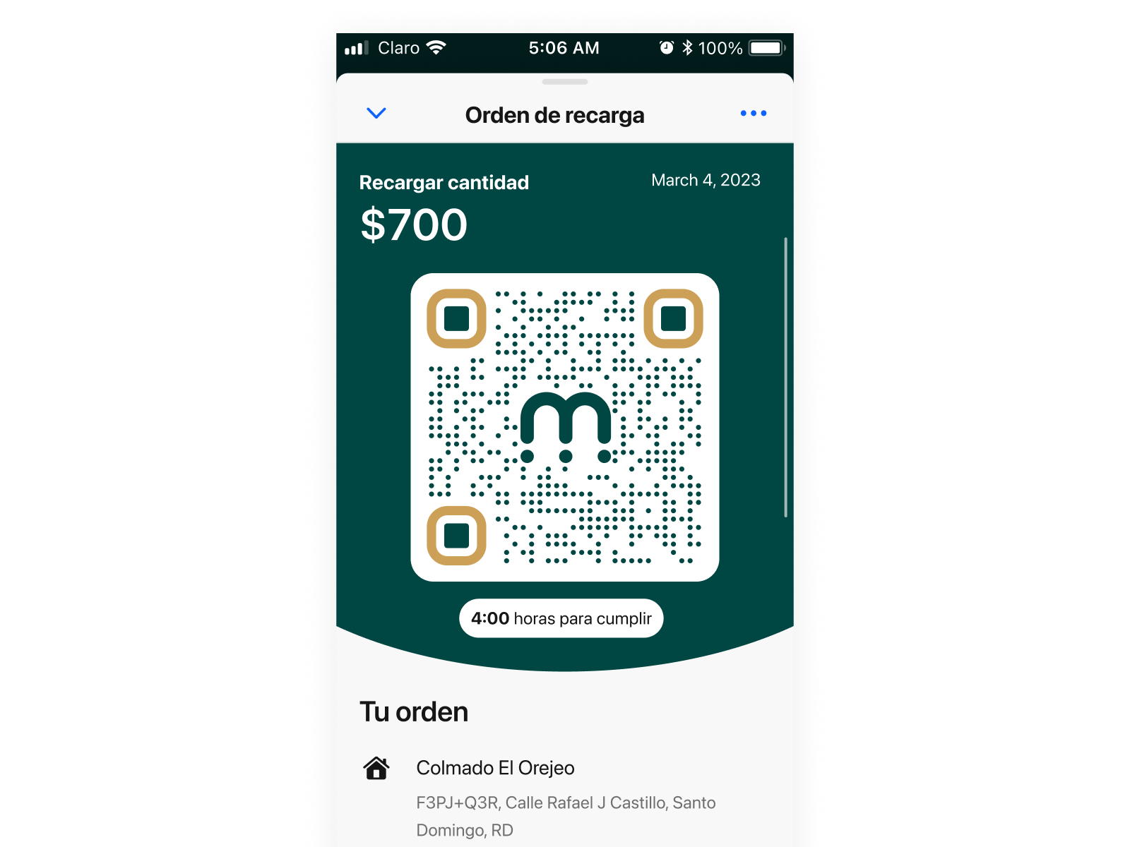
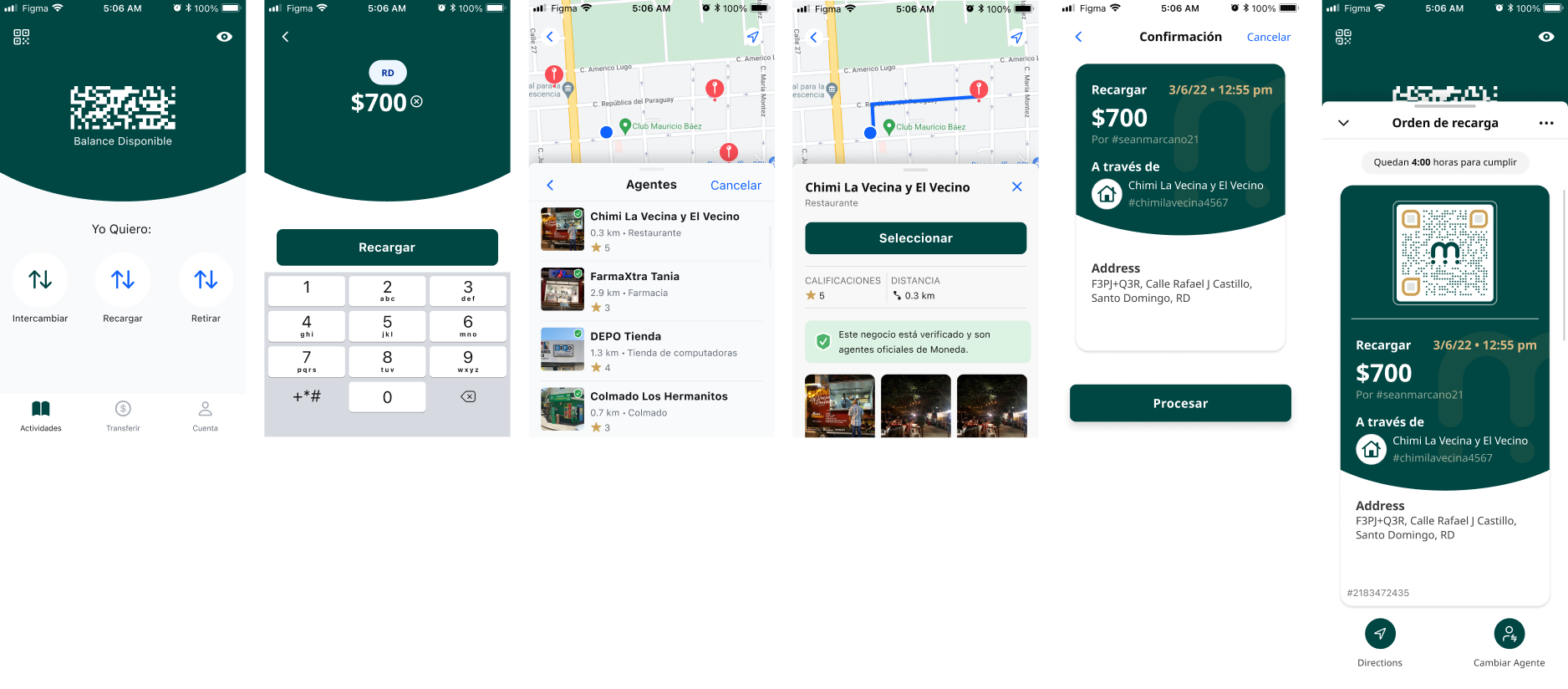
Field research pointed to one clear insight: QR codes were the most trusted and intuitive payment mechanism for our users. We built the entire navigation around that.
We removed the tab bar and replaced it with large circular primary action buttons — three clear transaction paths, minimal visual footprint, maximum clarity at the moment of decision.
Most iterations happened in code, not in Figma.
Between 1.0 and 2.0, the core design elements underwent extensive revision — but more importantly, the way we worked changed. Most iterations in this phase were carried out directly in code, prototyping on functional app builds rather than static mockups.
That decision made the feedback loop tighter and the signal cleaner. The gap between design decision and real-world consequence almost disappeared. What you saw in a meeting was what users were actually holding.
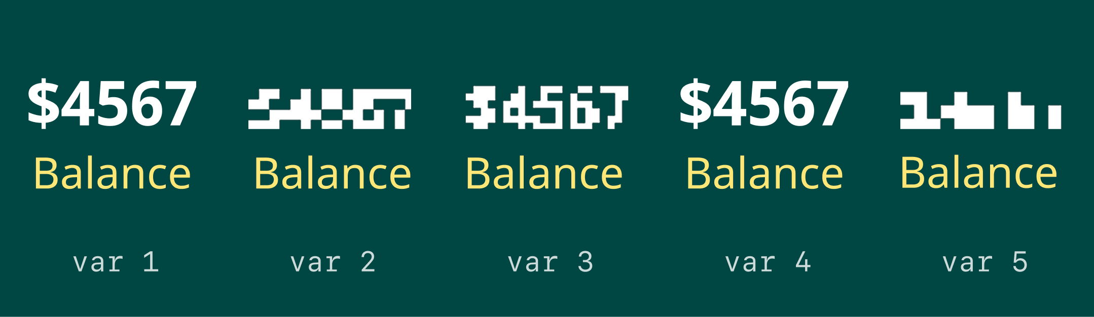
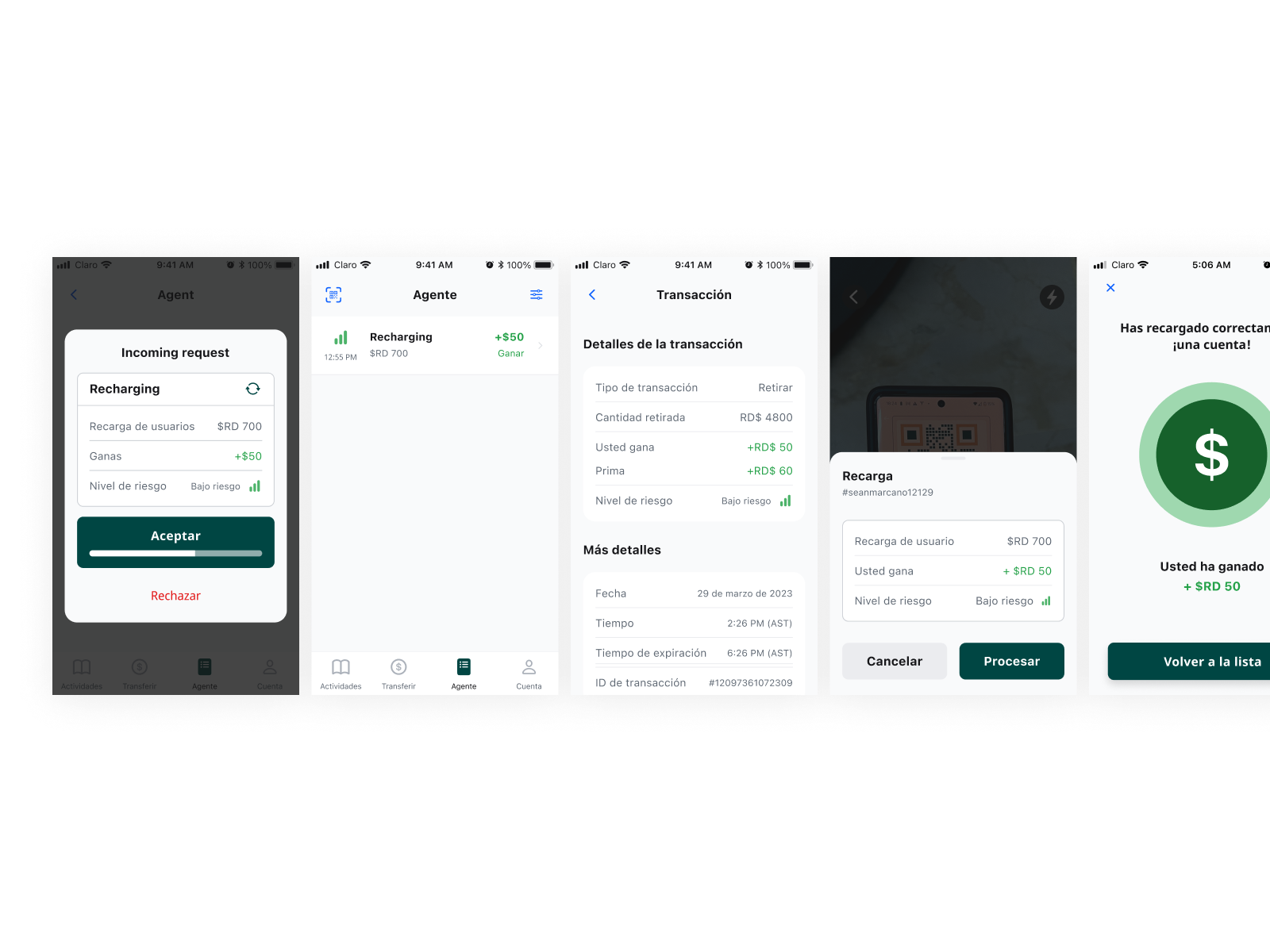
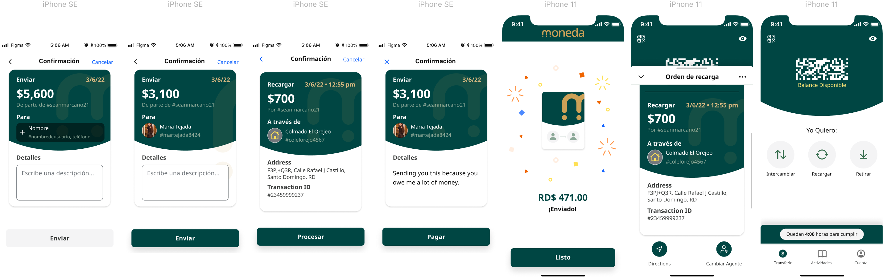
One of the most important — and most context-specific — challenges that emerged in 2.0: displaying an account balance in public in the Dominican Republic is a genuine safety risk. On a crowded bus, at a colmado counter, in a street market — your balance visible on screen makes you a target.
We needed a way to hide it. But the solution had to work on every device, not just Retina screens. We ran five distinct explorations: var 1 was the control, balance shown clearly. Vars 2 and 3 tested different scrambled character patterns. Var 4 returned to a clear display as a comparison anchor. Var 5 used block pixelation — chunky enough to be unreadable at a glance, but clearly intentional rather than a glitch.
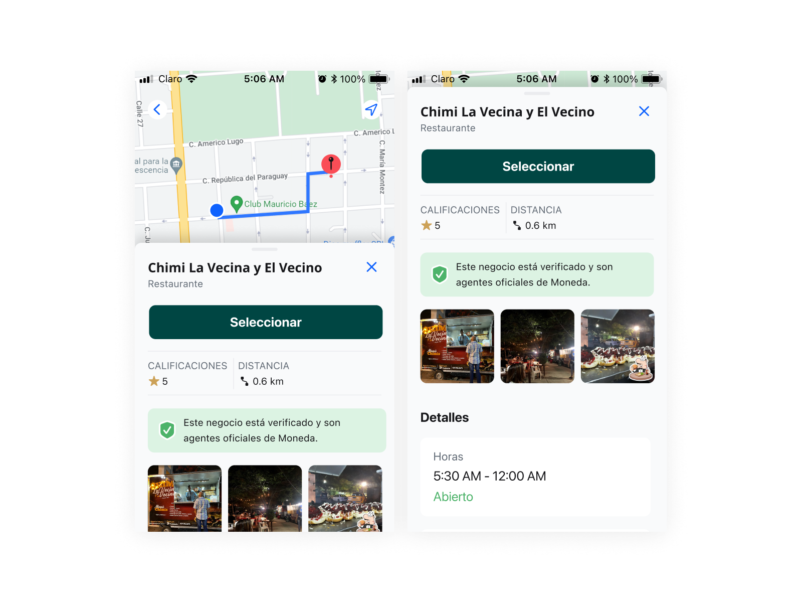
Moneda didn't operate on peer-to-peer transfers alone — it ran through a network of verified agents: local businesses, corner stores, and colmados registered to process transactions. The product had to work for both sides of that exchange.
Solving for the DR Peso — and for the ride home.
2.1 refined two things the field had surfaced: how users enter large amounts in a high-denomination currency, and the implemented solution for the balance security problem explored in 2.0.
The DR Peso is 56:1 against the USD — users regularly input four- and five-digit amounts. Before testing, I had an idea I thought would be distinctive: a ruler-style scrolling input that let users move through values like a physical dial.
It made sense on paper. In practice, users found it disorienting and slow. The interaction asked too much of people who were already navigating an unfamiliar product.
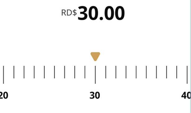
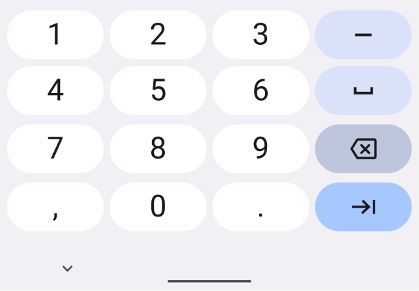
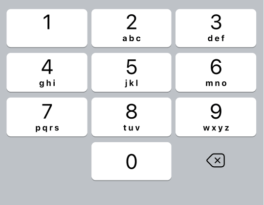
The answer was simpler: revert to the system keyboard. The interaction users already knew from WhatsApp and their native dialpad. Keyboard open on arrival, no custom chrome, no learning curve. We moved straight to high-fidelity and tested across iPhone SE and Android.
The pixelation approach from the 2.0 exploration was implemented and shipped. Block pixelation worked across every device — no Retina requirement, no ambiguity. Users understood instantly that the content was hidden on purpose, not broken.
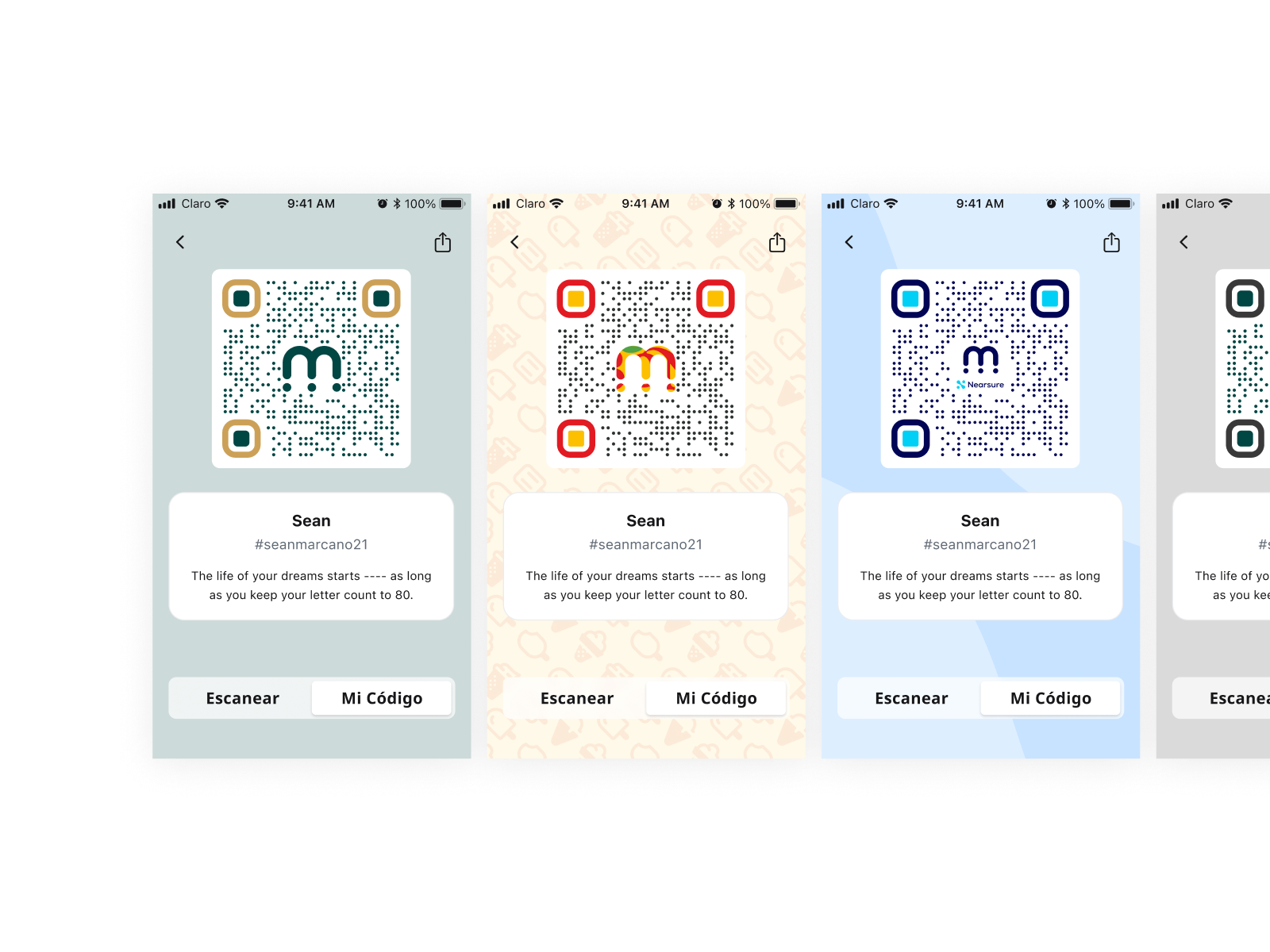
The green circle that travels with the user.
One of the most distinctive decisions in Moneda's design system was a dynamic green circle that shifts position throughout the app — appearing when a transaction completes, when an action needs confirmation, when a state changes. It's a visual cue, not a notification. A guide, not an alert.
Users begin to anticipate it, recognize it, and trust it. In an app where trust is the entire product, that kind of behavioral anchor matters more than it might anywhere else.
The broader system was built on reusable components, a consistent type scale, and Spanish-language copy written for the user rather than the product. Warm earth tones and deep green conveyed familiarity and trust — giving a growing team the foundation to ship new features without breaking the coherence that users had come to rely on.
A product that raised capital, moved legislation, and filled a gap LATAM fintech left open.
Moneda raised a $20,000 seed round from family and friends — then went on to secure $270,000 in total investment. Getting a product funded at all is rare: according to Fundera, only 0.05% of small businesses ever raise startup venture capital. Designing something worth investing in is a different kind of proof of concept.
Beyond the capital, Moneda contributed to a larger shift: the product became part of the conversation that helped push open banking legislation forward in the Dominican Republic — creating the legal framework for the kind of financial access the platform was built to provide.
At the time, LATAM was being left behind in the global fintech moment. While other markets were solving digital payments at scale, micro business owners and unbanked residents in the Dominican Republic had no viable option. Moneda was designed specifically for that gap — equitable design for MBUs navigating a cash-only lockdown economy, in a language and context that made sense for them.
What I took from this
This project taught me how to run a Google Design Sprint end to end — and what it looks like when that method is used as a research tool rather than a shortcut to answers. The field trip, the paper prototypes, the code-first iteration — none of it would have worked without the sprint structure forcing us to make our assumptions visible before we acted on them.
Next Project
Openfit · 2021
Express Checkout & Churn Prevention
33% less churn. 8% more conversions.
