Stockvu · 2020–2023
Stockvu

People of color are systematically underrepresented in investing. Stockvu was built to change that.
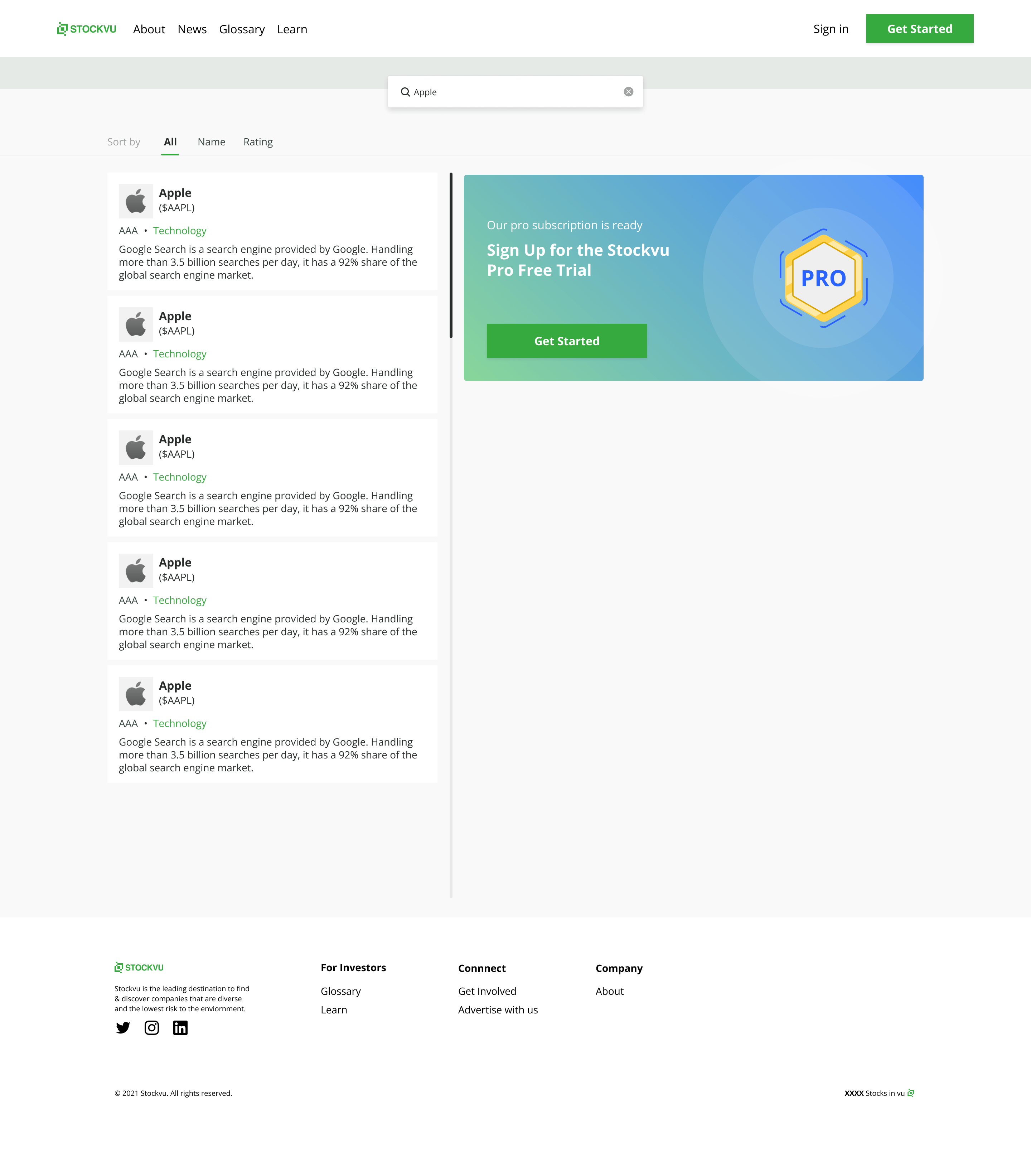
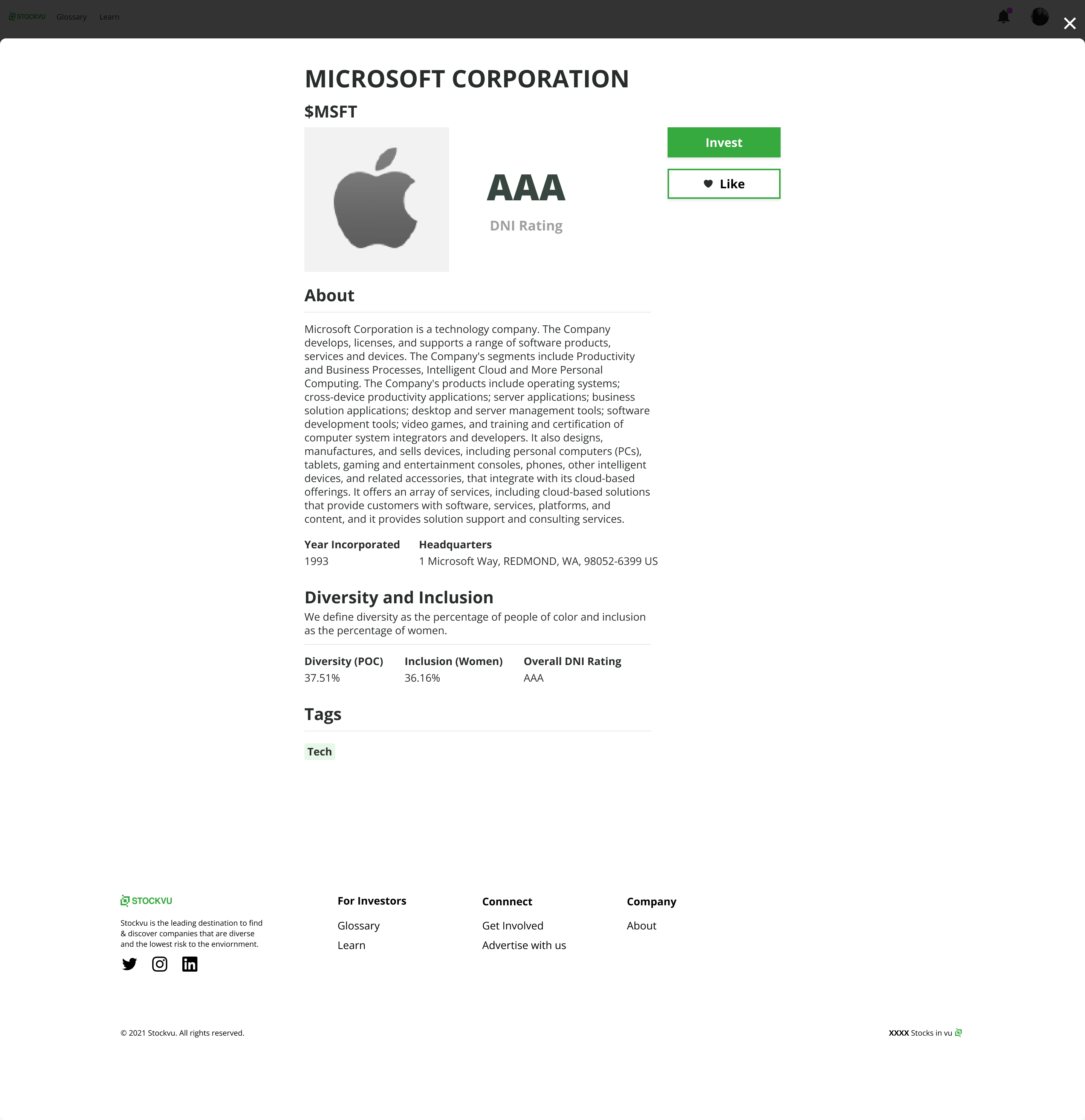
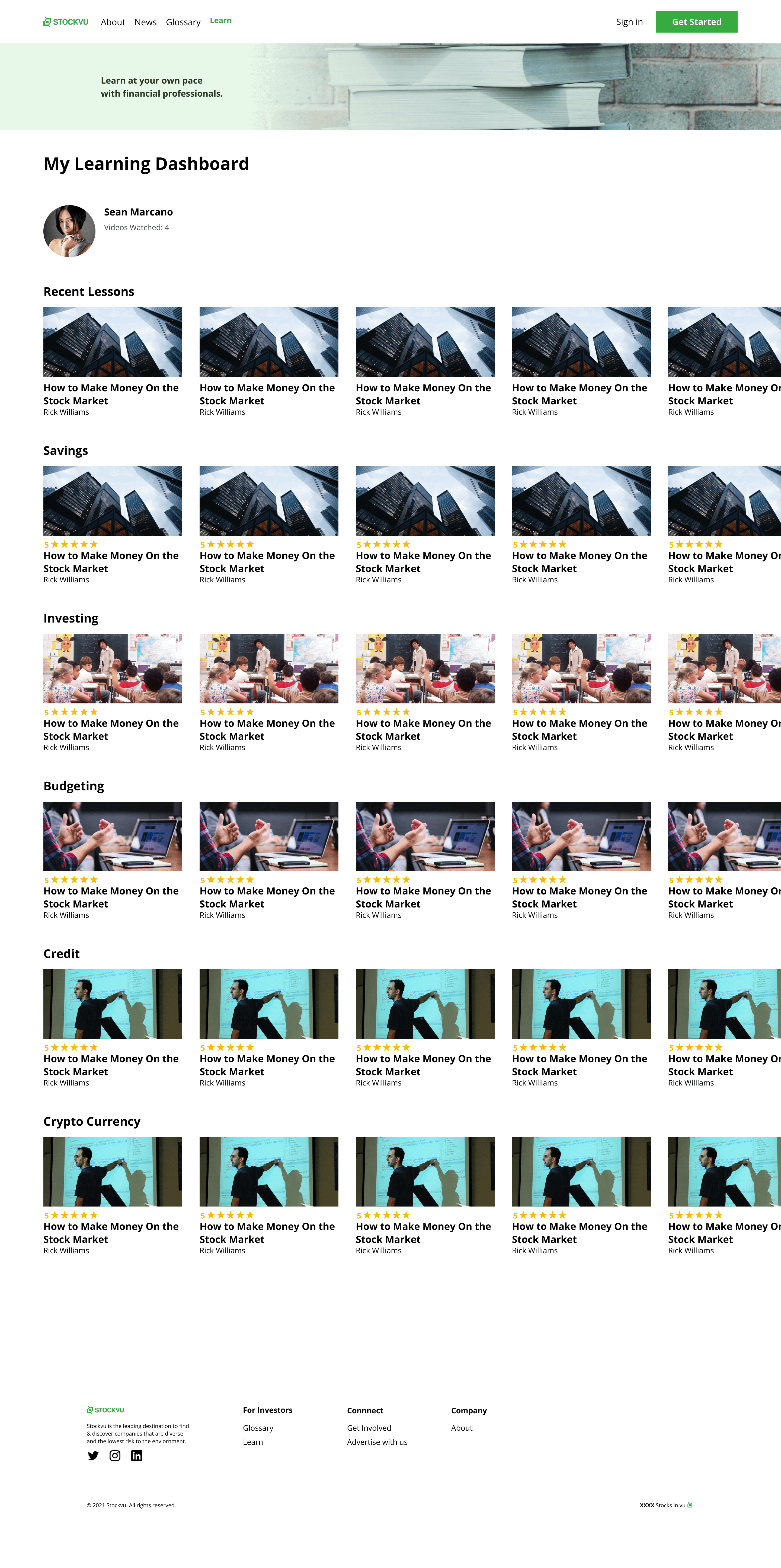
Stockvu is a financial literacy tool designed to empower individuals — particularly people of color — with the knowledge and resources to make informed investment decisions. Built on the web using Webflow for broad accessibility, the platform aimed to reach anyone with an internet connection, regardless of prior financial education or wealth background.
The Problem Behind the Product
People of color are disproportionately underrepresented in the investing world — due to lack of access to financial education, systemic barriers in the financial industry, and a wealth of resources that assume prior knowledge. The result: missed opportunities to build generational wealth. Stockvu was built to lower that barrier.
We validated the problem before building anything.
The design process started with a Pollfish survey to get initial signal on product-market fit — understanding whether the problem was real, who felt it most acutely, and what kind of tool they'd actually use. That initial research shaped every product decision that followed.
The approach was human-centered throughout: interviews with potential users, synthesis of pain points, and design decisions grounded in how people actually thought about money and investing — not how the financial industry talked about it.
From task flow to design system — three years of iterative build.
A clean, accessible investment education platform.
The final design was built around clarity and accessibility — stripping away the intimidating complexity of most financial tools in favor of progressive disclosure. Start with what matters to you, learn at your own pace, and build confidence through doing rather than just reading.
Next Project
Lambda Sigma Upsilon · 2019–2022
Brothr 79
Designed a brotherhood networking platform from scratch.
