TodayTix · 2022
My Orders

Customers didn't know where their tickets were — and they were calling to find out.
TodayTix had no centralized place for users to manage and track their ticket purchases. After buying, customers landed in a fragmented post-purchase experience — no clear ticket status, no easy access to order history, no self-serve way to understand where their tickets were in the delivery pipeline.
The result was a surge in support queries. Customers were calling and emailing about ticket delivery, ticket validity, and ticket protection redemption — all questions the product should have been answering on its own.
The product had no answer for: 'Where are my tickets?'
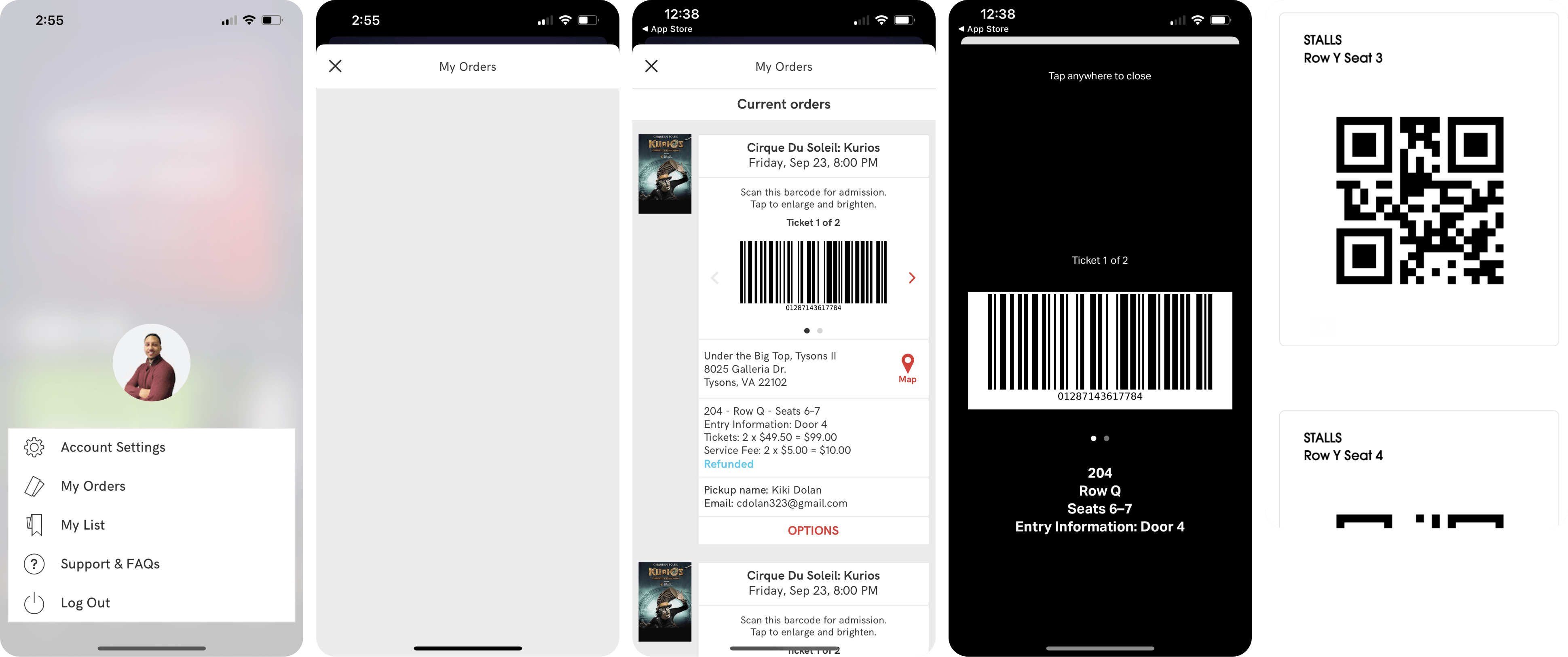
The legacy My Orders experience was buried in the account section — not accessible from the main navigation, not surfaced proactively, and not designed to communicate ticket status in any meaningful way. Customers who wanted to know whether their tickets had been issued, when they'd arrive, or how to redeem ticket protection had nowhere to turn except customer support.
The Business Cost
Every support query about a ticket that the product should have communicated proactively is a design failure with a measurable cost. Reducing that volume wasn't just a UX win — it directly freed support capacity.
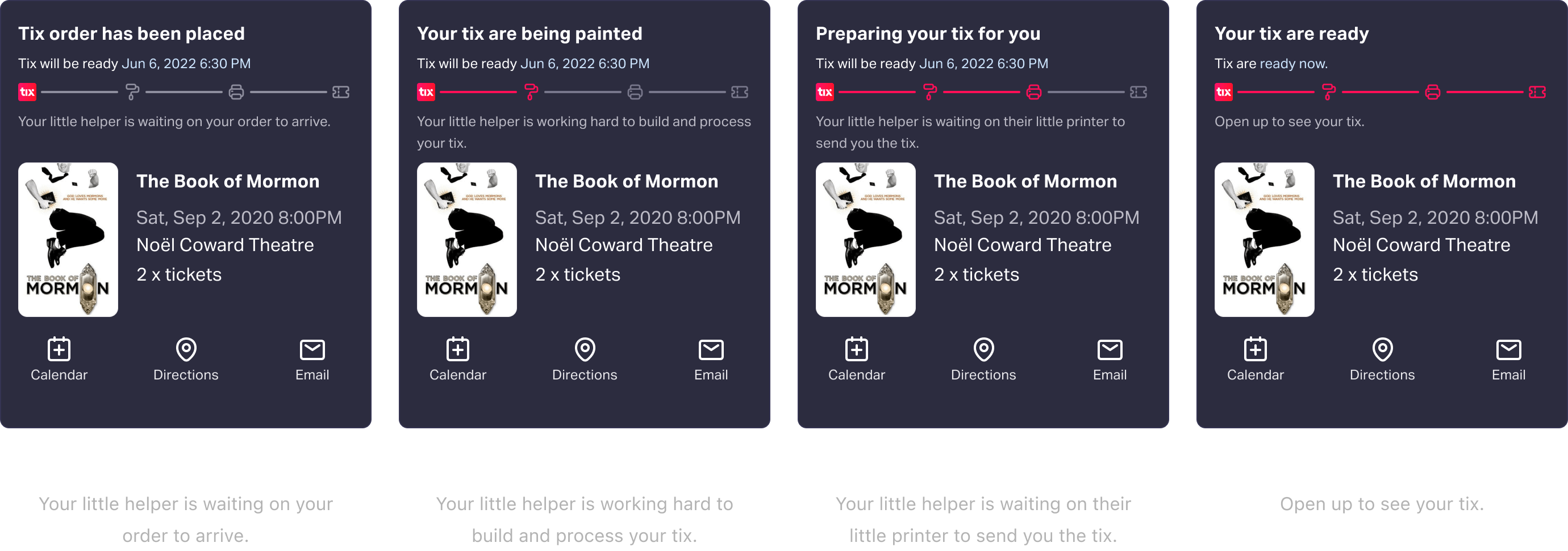
V1: Prioritize ticket status. Make it visible at a glance.
The first version focused on the highest-pain problem: in-progress tickets and communicating their status. I drew design inspiration from competitive research and the concept of progress companions — pocket guides that walk users through a journey rather than dumping information on them at once.
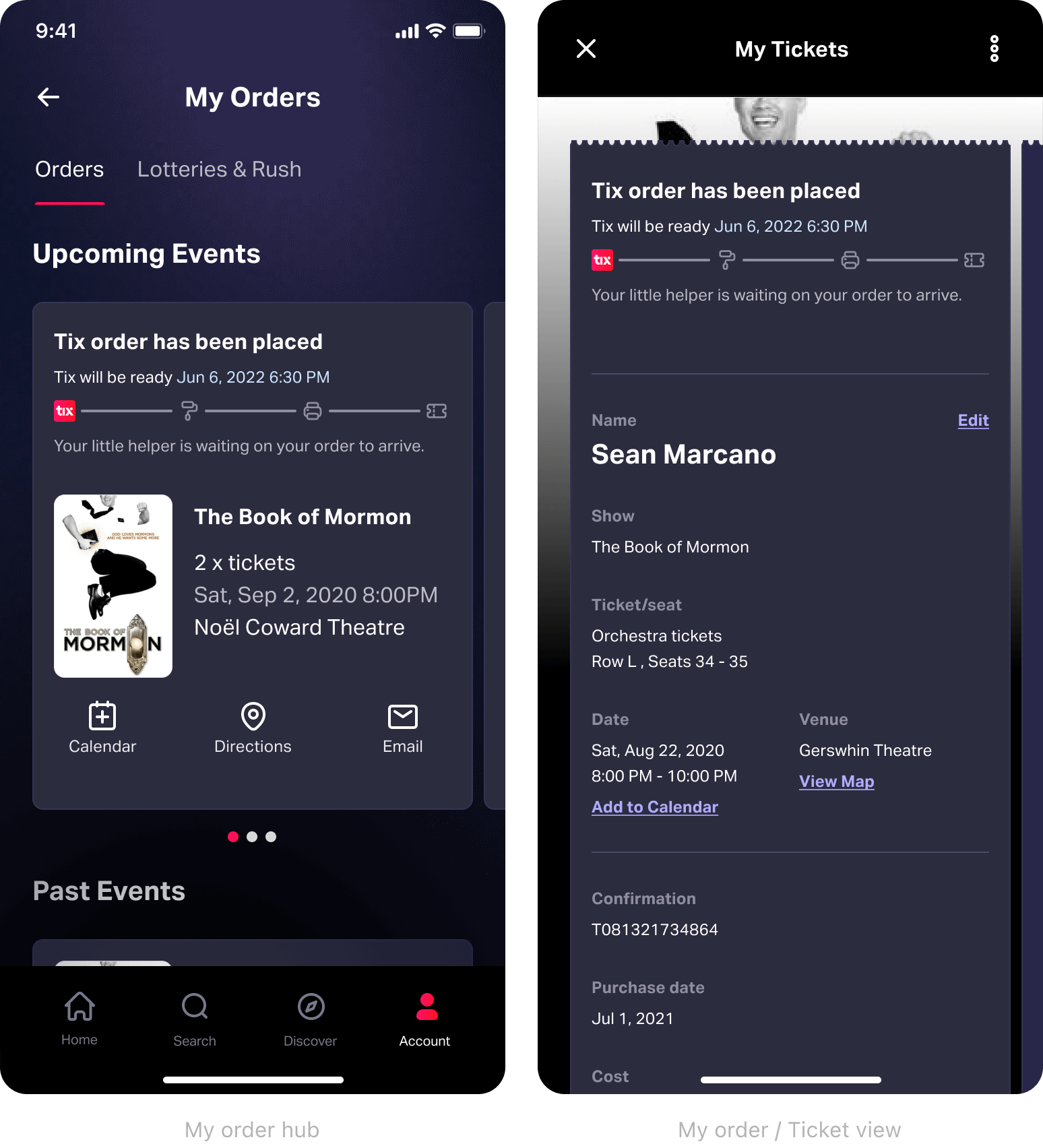
V2: Elevate access, reduce tech debt, make it a brand moment.
V1 solved the status communication problem but still had structural issues: My Orders was too buried to be useful, and the design leaned heavily on legacy components that were inconsistent with the evolving design system.
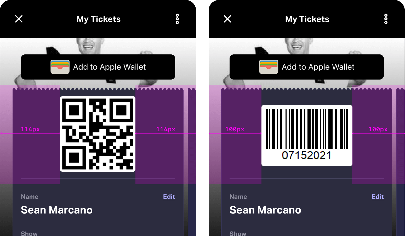
V2 had three goals: move My Orders to the tab bar for immediate access from anywhere in the app, replace legacy components with modern patterns, and turn the experience from a utility into something that felt like TodayTix.
More self-serve. Less support load. A foundation for future personalization.
My Orders gave TodayTix users a self-serve answer to the questions that had been driving support volume. Ticket status, delivery progress, QR codes, and ticket protection — all accessible from the primary navigation without a single support interaction.
What Didn't Ship (Yet)
Personalized show recommendations, ticket protection options at checkout, and enhanced filtering were all scoped and conceptualized but didn't make the release. They're ranked by ROI and ready for the next sprint — the design work exists, it just needs a roadmap slot.
Next Project
Moneda · 2021–2023
Mobile Secure Digital Wallet
Co-founded a P2P wallet for the unbanked.
